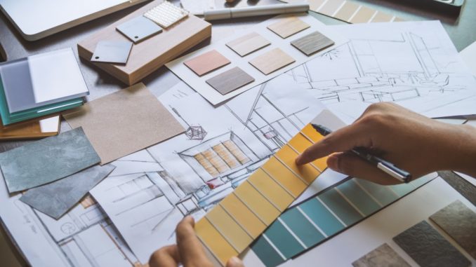
Everyone has a clear vision of their dream home. Finding a house that perfectly matches this dream is unlikely, but the good news is, you can design your own. For the past few months, you may have been eyeing that perfect sofa for sale in online stores and have been flipping through Pinterest, even touring the neighbourhood for inspirations.
However, all these ideas together will not result in an organised and well-designed space without applying the basic interior design principles. Knowing the basic design principles is crucial to create a cohesive and fabulous look.
Balance
In design, balance is all about creating equality or visual equilibrium. This is accomplished not just through the shapes, but through the colours, patterns and even textures as well. It is only achieved when the visual weights of the different elements in the room or space are evenly distributed along a focal point.
Balance can be achieved in three ways, namely Symmetrical or Formal, Asymmetrical or Informal and Radial.
- Symmetrical. Space is evenly split into two sides, and both halves are equally compensated. For instance, two chairs on either side of a table are symmetrically balanced. If applied too rigidly, this kind of balance can become boring.
- Asymmetrical. One side of the room contains a dominant element, while the other side is filled with lighter elements. This kind of balance is a little hard to achieve than symmetrical balance, but it offers more visual variety and can be more interesting.
- Radial. There is an actual central point from which all other elements seem to radiate. A dining room table with chairs around it is a good example of this kind of balance.
Harmony or Unity
Repeating design elements such as colour, texture and shape is one of the easiest ways to achieve harmony and consistent visual experience. When the furnishings and fixtures in a place work together, the result is a pleasing feeling.
On the other hand, mismatched elements like different colour schemes will lead to confusion and chaos in space. To achieve harmony and unity in design, you can start by using just one colour, even though everything else varies greatly in shape, texture and sizes.
Rhythm
 In a similar context, rhythm is about connecting movements between different elements to maintain a visual tempo. This is achieved in three methods. One of which is through repetition and the other two methods are through Alternation and Progression.
- Repetition. The simplest way to achieve rhythm is through repetition of any elements of design in an organised and orderly way.
- Alternation. This method alternates two or more elements in a regular pattern, like ABABAB or ABBABB or ABCABC, and so on.
- Progression. This method takes one element and arranges it in a regular ascending or descending pattern. A typical example would be a group of candles with varying heights arranged gradually to create a rhythm.
Scale and Proportion
Scale, in design principles, is the size of one object in relation to the other objects in a room. Proportion, on the other hand, refers to the relative size of the components that compose an object. Both of these design elements relate to size.
A high ceiling room, for example, implies that high rise furniture should be used to create a harmonious look in the room, as compared to low rise furnishings. The golden ratio in design was created to reduce the application of scale and proportion to a simple formula.
It combines a little bit of math, but the golden ratio is present even in nature and has been used throughout history. Approximately equal to a 1:1.61 ratio, the ratio of the smaller section to the bigger section should be equal as that of the bigger section to the whole.
A huge part of home designing is bringing about a cohesive look that results in feelings of comfort and harmony. Getting acquainted of the basic principles of interior designs will help you achieve just that. Once you have understood these principles, it is time to don that designer cap and start designing your dream house.
